Week 5
Lecture Report 4: Fore, Mid and Background
Avatar: The Last Airbender (ATLA)
ATLA is set in a world where some humans have the ability to telekinetically manipulate fire, water, earth or air. Only the Avatar can master of all the 4 elements, allowing them to keep balance between all 4 nations. There can only one Avatar living at a time, born into different nations each generation following the cycle of water, earth, fire then air. The four nations lived harmoniously until the fire nation attacked, seeking world dominance. However, during this crucial time, the Avatar vanished. The series is set 100 years after the attack, following Aang, the Avatar and the last Airbender, as he re-surfaces and goes on his journey to save the world.

|
| Figure 1.1. Book 3 Chapter 18 |
In Figure 1.1., Momo, Aang's winged lemur pet companion, sits in the foreground on the balcony, curiously watching as Aang sleep walks towards the beach. The middle gorund is the forest, the sea and the island that was not there prior to this scene. In the background, viewers see a beautiful cloudy and starry night sky.
As this scene plays out, there is hypnotic chanting music, indicating that Aang is being hypnotized to walk towards the ocean, while also causing confusion and worry for viewers. The island in the middleground is oddly and subtly the focal point of this scene, considering the fact that an island mysteriously appeared out of no where. There is an assymetrical balance to this scene, which can also subtly enhance the oddness and confusion for viewers.

|
| Figure 1.2. Book 3 Chapter 19 |
Figure 1.2. is when Aang finds out that he is actually not on an island, but a lion turtle. Lion turtle's are gigantic ancient creatures that existed since the beginning of time. In Figure 1.2., Aang and the lion turtle's hand/paw is in the foreground, the ocean water in the middle ground and the lion turtle head in the background.
Aang is seen facing the lion turtle, hoping to ask for advice on another solution to world peace other than killing Firelord Ozai. The lion turtle, having existed for centuries, is able to give Aang what he was searching for, a method to take away one's ability to bend. The lion turtle being ancient, wise and giant, easily made the main focal point in this scene by the sheer scale of the lion turtle and it taking up most of the frame. The symmetrical balance, neutral and bright colours allow there to be calmness to the scene, compared to the dark mysterious night in Figure 1.1., in where Aang oddly walks towards the mysterious island.

|
| Figure 1.3. Book 3 Chapter 20 |
Figure 1.3. shows on the Fireload throne stage. Princess Azula is Firelord Ozai's second child and his favourite child. She was named after her father's father, Firelord Azulon. She has always been daddy's and grandfather's favourite as she is a head strong personality, a powerful bender and ready to take over the world. This episode is when her father uses a comet to eliminate the earth kingdom rebels and become the Phoenix King, ruler of the world. He gives his firelord title to Princess Azula, which makes her unhinged and crazy on power.
This scene is dark, the only light coming from Azula's blue fire. In the foreground, we see the Dai Li Agents, who are sworn to Azula, kneeling in the foreground. Despite being in the foreground, no attention is given to them as they are in the dark and cut out of the frame. Azula is placed in the very center of the frame and in the middle ground. She sits on the stage, surrounded and lit by her bright flames. The background is a simple backdrop, plain and not attracting any attention despite being brighter than the foreground.
Sitting on the throne stage has always been a sign of power, position and respect in the series. However, when a firelord is surrounded by their fire while on the throne, it emphasizes their power even more as it is a glimpse of the strong burning fire within them. In a sense, the fire is meant to intimidate those kneeling at the bottom of the stage while also adding dramatic visuals to the scene. The fire also creates chiaroscuro lighting within the scene, adding dramatic effect. The lighting of the scene could also be interpreted as her life journey, her past (the background) was bright, her present (middle ground) is her absolute peak and brightest part of her time, and the foreground is foreshadowing her future which is about to be really bleak and dark as she eventually loses everything and is imprisoned.
In Class Exercise: Chiaroscuro

|
| Figure 2.1. Drawing in Illustrator Exercise |

|
|
Figure 2.2. Drawing in Illustrator Exercise Outlines |
Week 6
INSTRUCTIONS
Project 2: Decisive Moment
Movie Selections
La La Land
Video 1.1. and 1.2. overlap a little as I could not find a clip with the full thing. Just watching Video 1.1. makes my heart heavy and eyes tear up. Scenes like these: the last song Sebastian (Ryan Gosling) plays for Mia (Emma Stone); the last time they lock eyes; the last smile they give each other, these scenes are engraved into my brain and my heart. They are powerful scenes that made the whole movie tie up perfectly, scenes that I will remember forever.
Kimi no Na wa (Your Name)
I thought of the memorable scene where Mitsuha passes her red ribbon to Taki. I could not find the clip of the scene. This video was the best I could find of it, skip ahead to 0.23.
Ideas Round 1
References
|
|
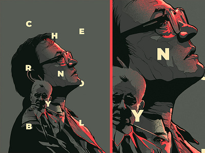
| Figure 6.1. Poster Reference |
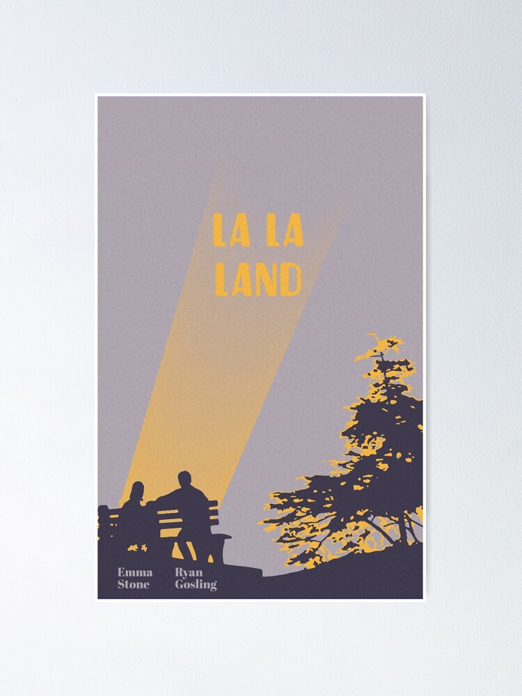
|
| Figure 6.2. Poster Reference |

|
| Figure 6.3. Poster Reference |
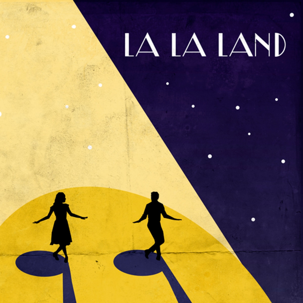
|
| Figure 6.4. Poster Reference |

|
| Figure 6.5. Poster Reference |

|
| Figure 6.6. Poster Reference |
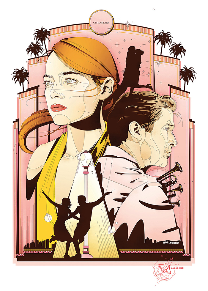
|
| Figure 6.7. Poster Reference |

|
| Figure 6.9. Poster Reference |
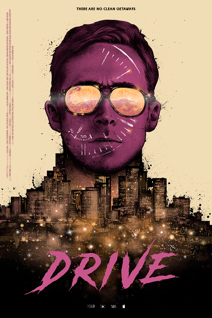
|
| Figure 6.10. Poster Reference |
Sketches

|
| Figure 7.1. Rough Sketch 1.1 |

|
| Figure 7.3. Rough Sketch 3.1 |
I decided to work on La La Land as I am emotionally connected to it. It also helps that I have the entire movie memorized, so I find it a little easier to work on. I started off with basic layout sketches of my ideas in Photoshop first before going into Illustrator to do the actual work. I want to capture some of the emotions she felt from seeing Sebastian on stage. Her sadness, pain, heartbreak and closure, all seen in Video 1.1. and 1.2.
Rough Sketch 1.1 is taken from Video 1.1. at the 2:46 minute mark. The idea I have in mind for animating Rough Sketch 1.1 is to have Mia smile. Just like the smile she gives after making eye contact with Seb as seen in Video 1.1. (2:46 - 3:15 minute mark). In her eye reflection, I placed Seb and his piano to inform viewers what scene this is from.
In Rough Sketch 2.1, the idea is from the moment just before Sketch 1.1, also seen in Video 1.1. at the 2:39 - 2:45 minute mark. In the actual scene, Seb is blurred out and not actually visible but I figured this layout might make more sense than Sketch 1.1.. In this sketch viewers can actually see Seb clearer than in Sketch 1.1, so it might make more sense. I added in some flowy lines inbetween Seb and Mia as a divider to show space. I want it to be flowing like a musical bar.
Rough Sketch 3.1 is the same idea but placed differently. Putting Seb infront and Mia to the back. I figure I could work more on lighting for this sketch. Placing Mia behind the spotlight for Seb with most her face hidden, except for the main important features to show emotion, covered by darkness.
For Rough Sketch 2.1 and 3.1, I have yet to decide exactly what to animate as there could be a few different things I could do with them. In Rough Sketch 2.1, I could animate Mia's face expression, the musical bar flowing or even shift lighting to focus on Mia then Seb. For Rough Sketch 3.1, I could shift lighting as well or make Mia smile, just like in Sketch 1.1.

|
| Figure 7.4. Sketch 1.1 |

|
| Figure 7.5. Sketch 1.2 |

|
| Figure 7.6. Sketch 2.1 |
Figure 7.2. and 7.3. are from Rough Sketch 1.1.. Sketch 1.1. uses the actual colours from the scene, whereas Sketch 1.2 uses softer, brighter and actual Emma Stone colours. I realised that I forgot to leave space for the movie title in my Rough Sketches, so I added temporary ones to see where they could fit.
Ideas Round 2
Sketches

|
|
|
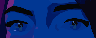
Sketch 3.1 is from Rough Sketch 3.1. I focused on Mia alone first to see if it would work without having Seb in the foreground. This portrait and colours of her are from the scene in Video 1.2. at the minute mark of 0:30 - 0:40.
Sketch 3.2 uses Emma Stone colours instead of from the actual scene taken. The logline is in Atami Bold instead of Regular and increased in point size. I want it to be as obvious as possible since it would be important to give context to the scene. However, both Sketch 3.1 and 3.2 still lacked clarity on the moment it is from.
At this point, I was not really thinking about animating yet. I was mostly trying to focus on capturing the moment and conveying it clearly into a poster. So with Sketches 3.1 - 4.1, I did not really have an idea of animation yet. Sketch 4.1 was just my attempt in experimenting with different layouts while using the same illustrations.
Progression
From Ideas Round 1

|
|
Figure 9.3. Progression 2.1 |
Progression 1.1 is of Sketch 1.1. I finally placed the fonts and texts I wanted to use instead of the placement holder fillers. I also added the piano and Seb in her eye reflection as seen in Figure 9.2.. It is not completely noticable in the blogspot image, but it is obvious in 720x900px size. I quite like these colours too, compared to the colours in Figure 7.5., so I decided to keep these colours. It also keeps the mood and tone from the actual scene.
Progression 2.1 was just an experimentation and adaptation of Sketch 2.1. I thought of maybe making it less... cheesy? with the flowing text. Above the logline, you can just barely see Seb and the piano. I wanted him to not take up too much attention but he is necessary to be in the frame for contect purposes. However, he is way too hidden, I do not like this layout, these colours and I do not like or care for her face expression here. Sketch 2.1 and Progression 2.1 are both definitely not what I want.
From Ideas Round 2

|
|
Figure 10.1. Progression 3.1 of Sketch 4.1 |

|
|
Figure 10.2. Progression 4.1 of Sketch 3.2 |

|
|
Figure 10.3. Close up of Progression 4.1 |

|
|
Figure 10.4. Progression 5.1 |

|
|
Figure 10.5. Progression 5.2 |

|
|
Figure 10.6. Progression 5.3 |
In Progression 3.1, I filled her eyes in and added in some white dots for a starry night. Yet still, I do not like Sketch 4.1 and Progression 3.1. The layout placement is poorly done and the colours are too much, in general, it is just way too messy and gross.
Since Sketch 3.1 and 3.2 lacked clarity of the moment, in Progression 4.1, I placed Seb in her eye reflection. There is not really anywhere else I could place him that would not feel out of place, since everything is in the center. Just like Progression 1.1, it is clearly visible in the actual poster size but not so much here on blogspot, so Figure 10.3. provides a close up. In both Progression 1.1 and 4.1, I placed Seb in the center of the circle, be it the iris or the light reflection, to attract as much attention as possible, it also helps with visual alignment and cleanliness. I figured for animation, I could play it out like the actual scene. Have the lighting go dark and focus on Seb playing through her eye reflection.
Progression 5.1 - 5.3 is from Rough Sketch 3.1, which I never actually got to before this. When doing Sketch 3.1, I told myself I would try it out later but I mostly forgot all about it or was not so keen on trying it out. It was only after Progression 4.1 that I realised that I really should attempt it as it might just work. And i think it really does. However, as for animating it, I am still at a lost. Maybe I could animate the stars to move, similar to a photo taken on long exposure?
Progression 5.1 I used a dark grey for Seb's silhoutte but it seemed a little too dark. So in Progression 5.2 I tried the colour I used for the spotlight in other poster layouts, a bright yellow. It now seemed a little too bright. I tried making it a darker yellow but it either would not match or was too bright. Either way, it attracted too much attention. I tried lowering the transparency to 80% to have it be the same bright yellow without attracting too much attention, but it was still a little too bright. If I lowered the transparancy anymore, it would be weird since we can see through him. In Progression 5.3, I used a brownish colour, similar tones to Mia but different enough to stand alone.
Animation Ideas Test
For Test Animation 1.1, I tried out the idea I had with the stars but it just seemed pointless to the story. It does not help with conveying the moment of the poster, instead it is just distracting to the whole composition.
I working with lighting with Test Animation 1.2. Giving spotlight to Seb and having Mia blur into darkness. This ties everything up well as viewers can see everything important clearly and in order.
I thought I would give a shot with Progression 4.1 as I quite liked it too. I faded Mia out to darkness while making her eyes and Seb brighter, allowing the focus to shift. Though I quite like this layout and animation idea, I also feel that the ending might be too much of something like a horror movie? It seems a little more of "Mia terrified" than "Mia heartbroken by seeing Seb play" but maybe I'm just reading into it too much after staring at it too long?
Animation Progression

|
|
Figure 11.1. AI Layers for Animation Progression |

|
|
Figure 11.2. AI Layers for Test Animation 1.2 |

|
|
Figure 11.3. Hue/Saturation Animation Progression |

|
|
Figure 11.4. Timeline for Final Animation |
I decided Test Animation 1.2 worked the best but it still needed to be refined. It needs more frames in order for the spotlight to flow better, so I went back into the AI file and adjusted/added layers there. Figure 11.1. is a screenshot of my layers after I added and readjusted them, allowing the spotlight to flow better. Figure 11.2 is the original layers for Test Animation 1.2.
After adjusting the layers in AI, I moved it into Photoshop and added the Hue/Saturation into each Smart Object Layer of Mia and ajusted them accordingly. Figure 11.3. shows the Hue/Saturation levels of my very last frame, Mia in total darkness Gif 3.1. is what I ended up with but I decided to adjust the delay for frame 13, see Figure 11.4., for a longer delay to let viewers take it all in.
I also then realised that in the poster, Progression 5.3, Mia was more saturated and it was more striking. So, I adjusted the Hue/Saturation bar again to a Saturation of +30 and adjusted other frames/layers accordingly. I also shifted my logline so the 'O' of 'TO' would be inline with Mia's Iris as it was a bit distracting and messy.
Final Outcome
La La Land Poster
La La Land Animated Poster
FEEDBACK
Ideas Round 1
- Sketch 1.1 and 1.2 can work but depends on how colour is used to offset the placements of the text
- The moment of the movie being portrayed in the posters are not clear
- Could try animating the eyes to be a moment of realization that Seb is playing the piano
- Seb does not necessarily need to be coloured, a silhoutte would do
- Simplify the design
Progression
- Progression 5.3 is more eye catching than Progression 4.1, it's more interesting to look at
- Progression 4.1 seems to make more sense to the moment as Seb is seen in her eyes
- In Progression 4.1, Seb needs to be more obvious
Animation Ideas Test
- Test Animation 2.1 is good since it gives more attention to Seb now, allowing him to be seen
- Test Animation 1.2 is better as it has a proper visual flow to it
REFLECTION
Experience
I have always enjoyed making posters, even more so for this
assignment as I am able to do it for a movie of my choice. I will take
any and every opportunity given to rewatch and talk about La La Land.
It was interesting too as I had to capture a moment and have it
conveyed in the poster. This was oddly more complicated for me as I
understood it, since I know the movie like the back of my hand, but
others did not.
I have always enjoyed making posters, even more so for this assignment as I am able to do it for a movie of my choice. I will take any and every opportunity given to rewatch and talk about La La Land. It was interesting too as I had to capture a moment and have it conveyed in the poster. This was oddly more complicated for me as I understood it, since I know the movie like the back of my hand, but others did not.
Observations
I realised that the ideas I think of beforehand and draw out are
often only stepping stones. The better designs I accomplish are only
after completing everything and thinking "hmm I should try this". I
am proud to say that it is a strength of mine to be able to continue
exploring, despite my original ideas not working so well. Even when
I do think that it is at an alright outcome or it is something I am
inclined to, I am not afraid of experimenting more to see if I could
do better.
I realised that the ideas I think of beforehand and draw out are often only stepping stones. The better designs I accomplish are only after completing everything and thinking "hmm I should try this". I am proud to say that it is a strength of mine to be able to continue exploring, despite my original ideas not working so well. Even when I do think that it is at an alright outcome or it is something I am inclined to, I am not afraid of experimenting more to see if I could do better.
Findings
I learnt that I can use both AI and Photoshop Timeline for creating
some basic animations. I have only ever used Adobe Animate and
Photoshop Timeline individually as animating softwares, and it was
interesting to find out that I can import and mess with assets that
way. I learnt some tips and tricks in using Adobe Illustrator that
will be very beneficial to me as I go on. It also makes me realise
that there truly is so much more to learn with these softwares
despite me using them for years.
I learnt that I can use both AI and Photoshop Timeline for creating some basic animations. I have only ever used Adobe Animate and Photoshop Timeline individually as animating softwares, and it was interesting to find out that I can import and mess with assets that way. I learnt some tips and tricks in using Adobe Illustrator that will be very beneficial to me as I go on. It also makes me realise that there truly is so much more to learn with these softwares despite me using them for years.
FURTHER READING
Murphy, M. (2017) The Posters of 'La La Land' [Online] The New York Times. Available at: https://www.nytimes.com/2017/02/24/movies/la-la-land-posters.html
Shaw, M. (2018) Why La La Land's Ending is So Powerful [Online] Youtube. Available at: https://www.youtube.com/watch?v=tIswQDWhlag




Comments
Post a Comment