
Alana Sofia Othman / 0353451 / Bachelor of Design (Hons) in Creative Media
Advanced Typography
JUMP LINKS
LECTURES
Lecture Video 4
Designing Type
The Need of Designing Type
The need for constantly creating new typefaces despite the fact that the world is filled with them is that it helps with creating or enforcing an identity. According to Xavier Dupré (2007) in the introduction of his typeface Malaga, designing type is necessary to continously improve legibility and also acts as a form of artistic expression.
Adrian Frutiger
|
|
Figure 1.1. (A few of) Adrian Frutiger's Typefaces
(Source: Dezeen) |
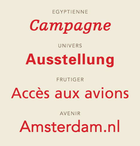
- Renowned 20th century Swiss graphic designer known for designing Univers, Frutiger, Avenir and many other typefaces
- One of the typeface designers that advanced typography into digital typography
- Frutiger is a sans serif typeface specifically designed for the Charles de Gaulle International Airport in France in 1968.
- The goal of the type was to create a clean, distinctive type that is easy to see both close and far away
- Considerations and/or limitations that were taken into account when designing this type was that the letterforms needed to be recognised even in poor lighting or when a reader moves past the sign too fast
- Adrian Frutiger tested unfocused letters to see which letterforms would still be identified.
- He also designed a new Devanagari font, a language he could not read or understand, for the Indian National Design Institute with the objective of simplifying the sacred characters without compromising the ancient calligraphic expression.
Matthew Carter
|
| Figure 1.2. Two of Matthew Carter's Typefaces (Source: Shillington) |

|
| Figure 1.3. Bell Centennial Type actual (left) vs printed (right) (Source: Pinterest) |
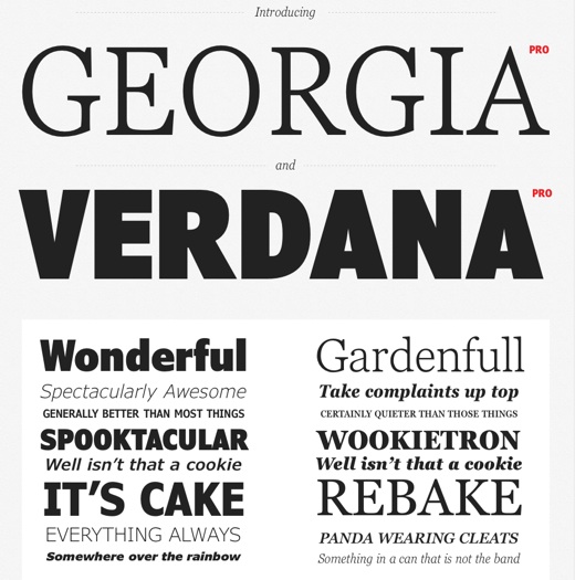
- Carter worked through the type designing ages of punch type setting, photo type setting and digital type setting
- Many of his fonts were designed to address specific technical challenges that early computers faced
- The Verdana type was created in 1996 for Microsoft with the objective of being legible even at a very small size on the screen, much like Cambria and Calibiri
- Verdana exhibits characteristics derived from pixels rather than the pen, brush or chisel
- Commonly confused characters within Verdana type are the lowercase 'i', 'j' and 'l'
- AT&T commissioned Carter to solve the technical and visual issues they faced with their used type, Bell Gothic, for their printed phonebook. He then created Bell Centinnial, using ink traps to let the ink fill the letter in on its own (Refer to Figure 1.3.)
Edward Johnston

|
| Figure 1.4. Edward Johnston's London Underground typeface (Source: Pinterest) |

|
| Figure 1.5. Eric Gill's Gill Sans typeface (Source: answermethispodcast) |
- Most known for the London "Underground" sign typeface, Johnstan Sans, designed in 1916.
- The objective of the typeface was "bold simplicity" that was modern yet rooted in tradition. To achieve this, Johnston combined classical roman open capital letter proportions with humanist warmth
- The London Underground Railway wanted to commission a typeface to create a standardised identity of all their railway signages
- His former student, Eric Gill, designed Gill Sans in 1927. He only claimed that it was heavily influenced by the London Underground Johnston Sans much after his gain to fame.
General Process of Type Design
- Research:
- History, anatomy, type conventions, terminologies, etc, should be known and understood
- It gives us context, inspiration, ideas, purpose, etc., allowing us to design better typefaces
- Sketching:
- Some designers use the traditional tool sets (brush, pen, ink, etc.) while some use digital tool sets to sketch. Both methods work, having their own pros and cons
- This stage is to begin creating the
letterforms along with ensuring consistency
- Digitization:
- There are professional softwares used for this, such as, FontLab and Glyphs
- Adobe Illustrator is also commonly used to design and then placed into specialised font apps. However, this method is frowned upon by purists
- Legibility of the entire form as well as the counter form should be focused on during this step
- Testing:
- Important for refining and correcting
certain and necessary aspects of the typeface
- It leads to important feedback as well as
learning if it is legible and readable
- Teething problems will become noticable and therefore will need to be further revisioned
- Deployment:
- If the testing stage was conducted rigorously, the teething issues during this stage will be minor
Typeface Construction
- Roman Capitals consists of a square and inside it, a circle that just touches the lines of the square in 4 places. Within the square, there is a rectangle three quarters of the size of the square and is positioned in the center.
- These grids along with the circular forms can help with crafting consistent letterforms
Construction and Considerations
- Construction:
- Depending on form and construction, the 26 letters can be grouped by certain aspects of its letterform. For example, Lowercase letters can be grouped into 'with ascenders' (b, d, l, etc.), 'with descenders' (g, p, j, etc.), 'wide sized' (w, m), 'medium sized' (a, c, s, etc.), 'narrow sized' (j, l, f, etc.).
- This would help simplifying the process of designing as we know it would borrow certain similar aspects, ensuring consistency
- Considerations:
- Visual correction is needed for the extrusion and protruding of curved forms past the baseline and cap line is important to pay attention to
- Visual Correction is also used for the kerning and tracking of letters.
Lecture Video 5
Perception and Organisation
Perception in Typography
- Perception is what viewers see and understand. However, this is often, if not always, manipulated by designers.
- Typography perception deals with the visual navigation and interpretation of the reader by contrast, form and organisation of content.
- Content can be textual, visual, graphical or in the form of colour.
Contrast in Typography
- Contrast helps with seperating the information, allowing readers to comprehend content easily
- There are several methods to do this, a few are listed below:
- Weight / Light and bold
- Size / Small and large
- Form / Roman and italic / Extended and Condensed
- Structure / Serif and sans serif /
Italic and blackletter
- Texture / A combination of many
applied to a block of text on a page (A visual
texture)
- Direction / Vertical, horizontal and all the angles in between
Form in Typography
- Plays a role in visual impact and first impressions
- When done well, it leads viewers eyes from point to point and is memorable
- Interplay of meaning and form brings a balanced harmony both in terms of function and expression
Organisation / Gestalt in Typography
- Gestalt is a german word meaning the way a thing has been placed together
- Gestalt theory emphasizes that the whole of anything is greater than its parts. It is based on the idea that we experience things as a whole
- Therefore, we need to remember to design as a unified whole
- There are several Gestalt principles. A few are:
- Proximity
- Similarity
- Continuity
- Closure
- Simplicity
- Symmetry
INSTRUCTIONS
Task 2 / Part 1: Key Artwork
Draft Sketches
Round 1

|
| Figure 2.1. Draft Outcome 1, Week5 (28th Sept - 5th Oct 2022) |

|
| Figure 2.2. Draft Outcome 2, Week6 (5th Oct 2022) |
I chose to use my initials A and S for Alana Sofia purely because I struggle with identity crisis. Depending on the place, people and situation, I tend to introduce myself by different names, often having to pause and think which one to use. I do not really have a preference of which people call me as I respond to both, but if I were to choose one, I could not. I exlcuded my last name (father's name) from my initials as... well... it's my father's name and it does not resonate with me. Thus, choosing the initials A and S.
In Draft Outcome 1, I had a few different ideas. Most of them were from random off-the-top-of-my-head ideas from looking through Pinterest and certain typefaces. I had a few typefaces I quite liked, chosen from the 10 font families provided as well as scrolling through Fontshare.
For most of them, I chose to use the lowercase 'a' and 's' as I aim to hint towards my small physique with a small letter. I also prefer using a double storey lower case 'a' as it is a older and more classic version of the letter. Oftentimes, due to my upbringing, I feel that despite my young age and being in Generation Z, I do not always fit in with the younger generation, feeling a little older and outdated from the majority of those in my age group. The double storey 'a' is also just a visual preference of mine.
Draft Outcome 2 was done in class after receiving some feedback. It was clear that I should work with a stronger rationale to my designs. Thus, the new sketches trying to incorporate more shapes into the letterforms. The outcome of G and H was an attempt to incorporate water as it signifies my 'go with the flow' energy. Outcome F was with the idea of an infinity sign aswell as the initial 's', to imply my willingness to never give up and try a million times. Outcome I was a poor attempt of making it look like a puzzle piece with the idea of "I can solve your design problems" but to be honest, halfway through I gave up with it.

|
| Figure 3.1. Draft Outcome 3, Week6 (5th - 12th Oct 2022) |

|
| Figure 3.2. Draft Outcome 4 Week7 (12th Oct 2022) |
Figure 3.1. was worked on over the week after feedback during Round 1 of draft sketches. I mostly played with the thick and thin strokes of Set H and tried the different waveforms for the 'A' crossbar. For Set E, I tried working on variations to get the letterforms of 'a' and 's' to merge smoothly. Although, I liked some of them, I also felt that they all lacked a little something more. I felt really stuck and could not figure out how to improve it but decided to just roll with it anyways.
However, during feedback session, I was advised to scrap everything and just try something completely new. So, in about an hour or two, I came up with Draft Outcome 4 and the only one I really liked was G1. The idea was to just use the absolute basic shapes to create something, much like building blocks. It aims to say that as a designer, I can take the simplest forms/things and create something new or look at it in a different perspective. A little bit of the Bauhaus feel with the underlying idea of simplicity and geometry.
Refinement
Draft H
|

During feedback, it was suggested that Set H might look better with a circle around it. I tried it and although I liked it, I still was not so sure how I really felt about it. Although I had a rationale behind it to relate it to me and I did like it (still do of course), I was not so sure if it looked like me. Its safe to say that the idea is solid but the execution just did not seem to stick so much.
Draft G

|
| Figure 4.2. Refinement of Set G, Week7 (12th Oct 2022) |
After a second round of feedback, it was suggested that I experiment with different weights of my letter forms. I was also asked as to why I chose a circle instead of a square for my 's' and it was a question I did not have an answer to, it was just something I did automatically. So, I thought I might as well give it a shot and I quickly realised that it gives it more contrast. If everything were too square, it just looked... bad. I tried different weights to the 's' but decided I liked it as a medium-ish weight. If the gaps of the 's' were too small it just made me think of a shuriken, and if it was too big, it looked more like an = sign, which makes no sense. I also decided to try curving the edges a little so not everything would be too sharp or too round while also giving the gaps of 's' a little bit of colour to bring the 's' out more. Finally, I landed on 5.3.
Final Outcome

|
| Figure 4.3. Final Logo JPG, Week7 (12th - 19th Oct 2022) |
Task 2 / Part 2: Collateral
Animation
Round 1
I started with the logo animation as I knew it would be the most challenging collateral for me to work on. Eventhough I have almost zero clue on how to use After Effects, I chose to work on the animation in this software. I usually prefer working on Adobe Animate but I do know the general difference of Ae and An, allowing me to understand that After Effects would be better suited to get this specific task done.
I went in blindly, with not much of an idea of what or how to animate. I played around and came up with Video 1.1. I thought it was decent, but I also felt it was kind of a basic corporate animation look with not much personality. So I gave up halfway and refused to even try completing this animation.
Round 2
I decided to start fresh and worked in a completely new file. I looked back at my final Task 1 choices and realised I should try attempt the whole "balancing of shapes" idea. So, I worked on that and managed to create something with a little more authenticity and personality.
Final Animation
Collateral
Mockups

|
| Figure 5.1. Mockups, Week7 (12th - 19th Oct 2022) |
I chose 4 different collaterals: bookmarks, stickers, letterheads, postcards. While creating the bookmarks, I realised with the basic shapes from my logo, I could make faces with it. I made a few different ones and continue to use it throughout the collaterals for consistency of the brand. I used the cover of my zine that I made a few years ago for the book cover in the bookmarks mockup.
Instagram layout

|
| Figure 5.2. Colour Layout Test, Week7 (12th - 19th Oct 2022) |
Before continuing, I realised that I should plan the layout of the main colours of the posts. I tried different coloured layouts trying to see what would work best. I eventually decided to go with the far left bottom colours with the animation with purple background in the middle.
Extra posts & Instagram Layout

|
| Figure 5.3. Carousel post, Week7 (12th - 19th Oct 2022) |

|
| Figure 5.4. Instagram Layout, Week7 (12th - 19th Oct 2022) |

|
| Figure 5.5. Instagram Layout, Week9 (26th Oct - 2nd Nov 2022) |
I made the carousel posts talking about design principles. I was not entirely sure what the other 3 posts should be, so I decided to relate it to me and my Instagram account. I do not really use Instagram anymore and I havent posted anything since 2020. Last year, I put "Error 404" in my bio because I dont use Instagram and I thought it was funny. So, I decided to relate the other 3 posts to the fact that Im MIA on Instagram.
During week 9 feedback, we were reminded that it is compulsory to have an image of ourselves in the post. So, I quickly added that in with 2 extra post to fit the 3 row tiles. It was also suggested that I could have utilised my patterns more, which was something I did not really think about. Thus, my two extra post being of my patterns.
Final Outcome
Instagram Account: instagram.com/lanasofiana/

|
| Figure 6.1. Final Instagram Post 1 JPG, Week8 (19th - 26th Oct 2022) |

|
| Figure 6.2. Final Instagram Post 2 JPG - Collateral 1, Week8 (19th - 26th Oct 2022) |

|
| Figure 6.3. Final Instagram Post 3 JPG, Week8 (19th - 26th Oct 2022) |

|
| Figure 6.4. Final Instagram Post 4 JPG - Collateral 2, Week8 (19th - 26th Oct 2022) |

|
| Figure 6.6. Final Instagram Post 6 JPG - Collateral 3, Week8 (19th - 26th Oct 2022) |

|
| Figure 6.7. Final Instagram Post 7 JPG - Carousel 1, Week8 (19th - 26th Oct 2022) |

|
| Figure 6.8. Final Instagram Post 7 JPG - Carousel 2, Week8 (19th - 26th Oct 2022) |

|
| Figure 6.9. Final Instagram Post 7 JPG - Carousel 3, Week8 (19th - 26th Oct 2022) |

|
| Figure 6.10. Final Instagram Post 7 JPG - Carousel 4, Week8 (19th - 26th Oct 2022) |

|
| Figure 6.11. Final Instagram Post 7 JPG - Carousel 5, Week8 (19th - 26th Oct 2022) |

|
| Figure 6.12. Final Instagram Post 7 JPG - Carousel 6, Week8 (19th - 26th Oct 2022) |

|
| Figure 6.13. Final Instagram Post 7 JPG - Carousel 7, Week8 (19th - 26th Oct 2022) |

|
| Figure 6.14. Final Instagram Post 7 JPG - Carousel 8, Week8 (19th - 26th Oct 2022) |

|
| Figure 6.15. Final Instagram Post 8 JPG - Collateral 4, Week8 (19th - 26th Oct 2022) |

|
| Figure 6.16. Final Instagram Post 9 JPG, Week8 (19th - 26th Oct 2022) |

|
| Figure 6.17. Final Instagram Post 10 JPG, Week9 (26th Oct - 2nd Nov 2022) |

|
| Figure 6.18. Final Instagram Post 11 JPG - Me, Week9 (26th Oct - 2nd Nov 2022) |

|
| Figure 6.19. Final Instagram Post 12 JPG, Week9 (26th Oct - 2nd Nov 2022) |
FEEDBACK
Week 6
Draft Sketches
Round 1 - Figure 1.1.
- C 1.1 is the most legible but it is also not very unique.
- The 'a' in E 3.1 is not noticable
- In E 3.2 the 'a' is slightly more noticable but not completely
- The 'a' and 's' needs to sit together in a more coherent manner. It needs to be true to both their shapes and not fight for attention
- The gap/gutter space between the 's' and 'a' is too odd and if zoomed out, will be affected poorly
Round 1 - Figure 1.2. (H 1.1)
- The crossbar of 'A' needs to be more in sync with the wave form
- The shape needs to flow smoothly
Week 7
Draft Sketches
Round 2
Week 9
Extra Posts & Instagram Layout
Instagram Layout (Figure 5.4.)
- An image with my face needs to be there
- The patterns could have been utilised more
REFLECTION
Experience
This assignment was very tiresome and time consuming as there were several different parts to complete. I was grateful for this assignment being in line with the Independent Learning Week since it gave me more time to work on the assignment. It was also my first time using After Effects, which was not entirely challenging but time consuming.
Observations
I have always wanted to learn to use After Effects but never really got around to really learning it. When I tried it out a few months ago, I found it complicated and tedious to use. However, for this assignment, I needed to use it and I was able to learn to use it in a few days. So it's safe to say that I simply just was not comfortable with it but when I put my mind to it, of course I can learn it quickly
Findings
I learnt that sometimes I need to remember to let go a little of the ideas I have in mind and not try force it so much when I am stuck. Although it is something I know of and try to practise it, I still sometimes do not remember when to call it quits on my ideas. I also realised that when it comes to learning anything new, I need to just put my mind to it and not worry too much.
FURTHER READING
Cantor, A. M. (2019) The Importance of Branding: Why Branding Matters [Online] 99 Designs. Available at: https://99designs.com/blog/logo-branding/importance-of-branding/
Monograms/Lettermarks are essentially logos, which are important for branding. Logos and branding help give brands a direction, purpose and helps in build a connection with customers. The image above shows how important branding and rebranding are important. Microsoft, a multinational technology corporation since 1975, rebranded their logo to sustain the mega-brand for long term use after the several years and change that the technological world has been through.
Goldring, K. (n.d.) Monogram Logos: How to Deliver the Ultimate Punchline [Online] Tailor Brands. Available at: https://www.tailorbrands.com/blog/monogram-logos
Keung, L. (2020) What Is A Monogram? Types, Designs and Ideas [Online] Envato Tuts+. Available at: https://design.tutsplus.com/articles/what-is-a-monogram-types-designs-and-ideas--cms-35023

This article talks about the many different monogram designs. The image above shows a few of the most popular arrangements of monograms. The idea of monograms are to capture the essence of the brand, person, people, etc. with initials.
Comments
Post a Comment